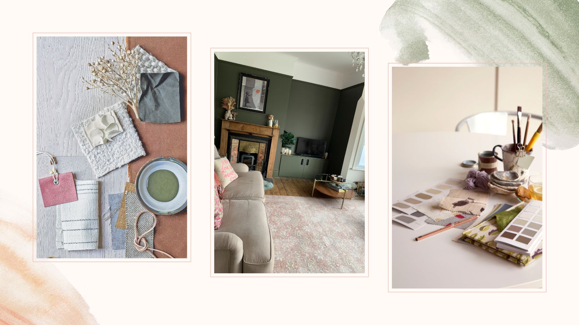
Complimenting Colours and Designs

Finding the perfect wall art is not just about choosing something you like. It is about selecting artwork that fits into your living space in a way that feels balanced and intentional. When you create with Artistico Art, you have the chance to shape every detail of your piece. Understanding how colours and design elements work together will help you make the most of that creative freedom.
Complementary and Harmonious Colour Choices
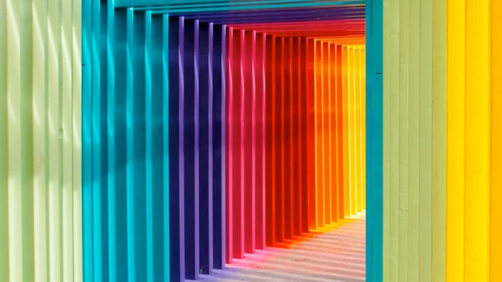
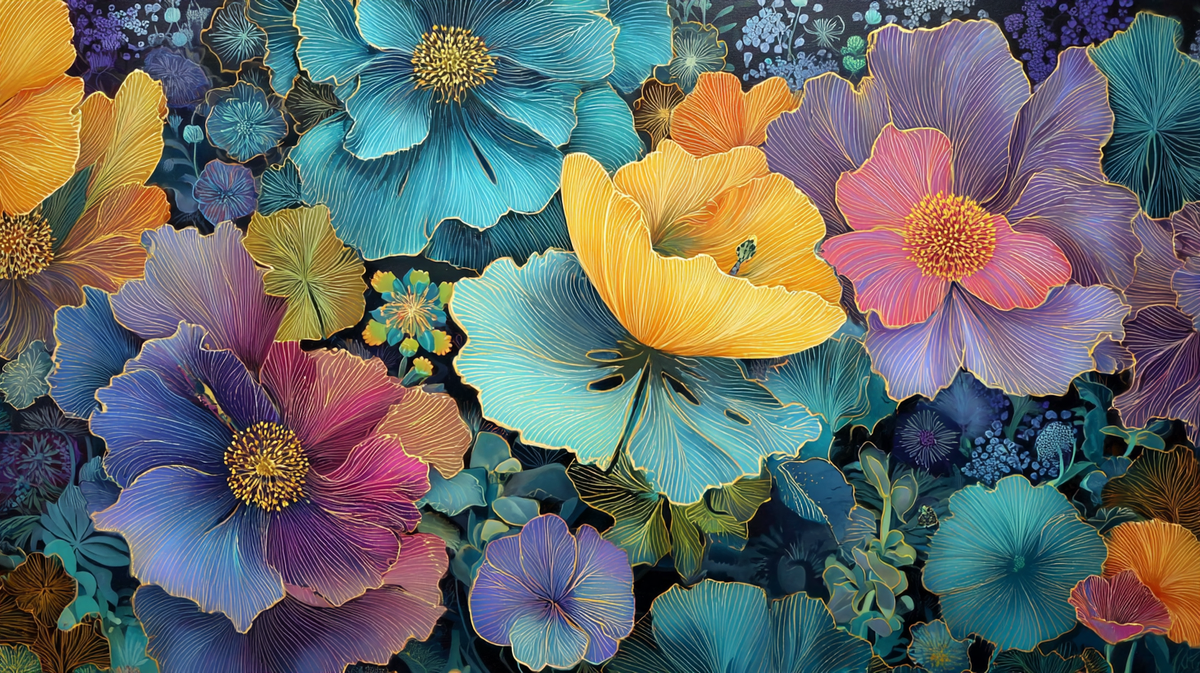
Complementary colours are found opposite each other on the colour wheel. Examples include blue and orange, red and green, or yellow and purple. These combinations create strong visual contrast and energy. When used in the right way, they can make a bold and eye catching statement within a room.
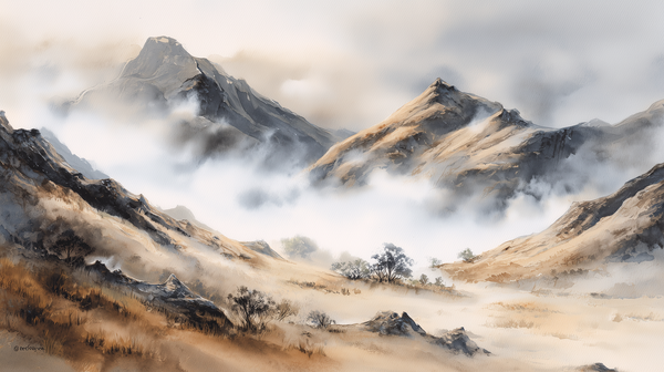
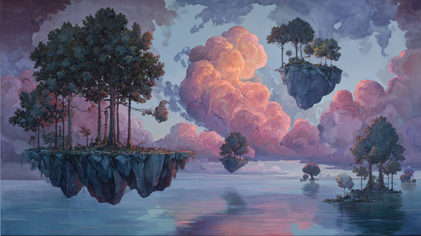
If you prefer a more calming and cohesive look, try using analogous colour schemes. These are colours that sit next to each other on the wheel, such as teal, blue and green. This kind of palette tends to create a more unified and relaxed visual effect that works well in minimalist or Scandinavian interiors.
Apply the 60-30-10 Rule
A popular approach in interior design is the 60-30-10 rule. It divides your colour scheme into three parts: 60 percent for the dominant base colour, 30 percent for a secondary tone and 10 percent for an accent. You can use this rule to shape your Artistico Art prompt and make sure the colours in your artwork reflect the space around it.
For instance, if your room features cream as the base, forest green as a secondary tone and brass accents, consider including those tones in your prompt to create visual harmony.
Consider Colour Temperature and Contrast
Warm colours such as red, orange and yellow create a cosy and inviting atmosphere, while cool colours like blue, green and violet add freshness and calm. Knowing which temperature dominates your space can help you decide what mood your artwork should carry. If your room feels cool and clean, a warm toned painting can soften the space. If your room is warm, a cooler palette might create balance.
You should also think about contrast. Combining light and dark tones, or muted colours with saturated ones, adds depth and interest. However, too much contrast can feel overwhelming. The key is to create a focal point and keep the rest of the composition in harmony.
Tips for Your Artistico Art Prompt
Before writing your prompt, consider the following:
- What are the dominant and accent colours in your room
- Do you want your artwork to contrast or blend in
- Are you aiming for a warm or cool mood
- Would a subtle colour palette or a bold one suit the space best
The clearer your direction, the more your artwork will feel like it belongs in your home.
Start creating your fully personal and unique one-of-a-kind wall art at Artistico Art